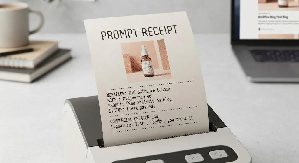
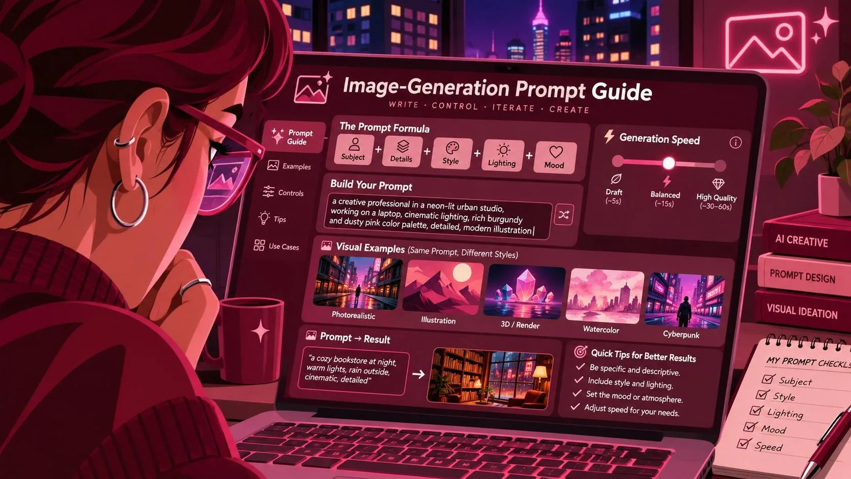
The short answer in this z-image turbo prompt guide: describe the subject, placement, lighting, and delivery constraints in plain language, then change one variable at a time. Start with a small batch rather than a paragraph of competing adjectives. The workflow below is a proposed test plan, not a claim that these prompts have been verified in Z-Image Turbo; interface options and model behavior should be checked in the version you use.
For a commercial brief, a beautiful image is only the starting point. The useful one also has space for the offer, a believable product shape, and enough resolution for the placement. Those constraints belong in the prompt and the review process, not in a frantic last revision.
Build a prompt around the brief
Before writing, reduce the assignment to four decisions: what must appear, where it must sit, what visual treatment is needed, and what the final image must accommodate. A launch ad for a fictional skincare jar might require one container, a calm studio look, open space for a headline, and a vertical crop.
Here is a starting prompt to try:
“Vertical studio photograph of a single unbranded amber skincare jar with a black lid, positioned in the lower right of the frame. Warm ivory background, soft window light from the left, subtle shadow, restrained editorial styling. Leave the upper left area clear for a headline. No hands or additional products.”
This is an illustrative prompt, not a documented successful output. Its useful feature is specificity: the jar has a location, the light has a direction, and the empty space has a job. If the assignment has a real product, treat this as a composition concept, not proof that the model can reproduce the packaging accurately.
Avoid loading the first attempt with camera settings, mood words, and material details that fight one another. “Soft window light” and “hard flash” describe different setups. Choose the one the brief needs, then see what the image actually does.
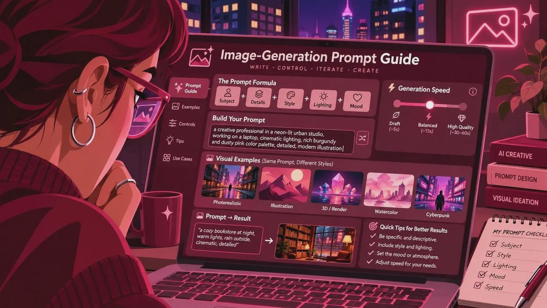
A z-image turbo prompt guide to controlled variations
Run a baseline batch using the same prompt and settings. Four images is a practical starting allocation, not a performance benchmark. Save the full prompt, dimensions, model or checkpoint identifier, interface, and any seed or generation settings the interface exposes. Record the date and any relevant workflow changes too.
Judge the batch against the brief before changing anything. Is the jar on the requested side? Is there usable headline space? Does the lighting support the intended mood? Note both successes and failures; a striking image with no room for copy has failed the layout requirement.
Then change one prompt element. For instance, replace “soft window light from the left” with “direct overhead studio light” while keeping the subject, background, crop, and placement unchanged. Run another batch and compare the two groups. This makes it easier to attribute a visible difference to the lighting instruction, although random variation can still affect the result.
If your interface supports a fixed seed, use it for an additional comparison and document it. A seed can make a comparison easier to organize, but it does not guarantee identical results across different software, models, settings, or implementations. If seeds are unavailable, compare several images per version instead of treating one pair as conclusive.
Make room for the actual design
A prompt can request negative space, but a generated image still needs to work with real typography. Bring a candidate into the intended layout and add a rough headline, logo, and call to action. Check the smallest intended display size. A clear corner in an image viewer may turn out to be too narrow once the actual copy is in place.
If the headline overlaps the product, revise the spatial instruction before adding more style language. Try “jar occupies the lower right quarter; upper half is an uninterrupted background.” If the background becomes busy, describe the surface more narrowly: “plain warm ivory backdrop, no props.” Keep the rest of the prompt stable for that comparison.
For a campaign that needs both vertical and square placements, generate or adapt each composition for its intended crop. A tight vertical image may not survive a square crop without cutting off the product. Requesting extra space is useful, but verify the exported dimensions and crop in your design tool.
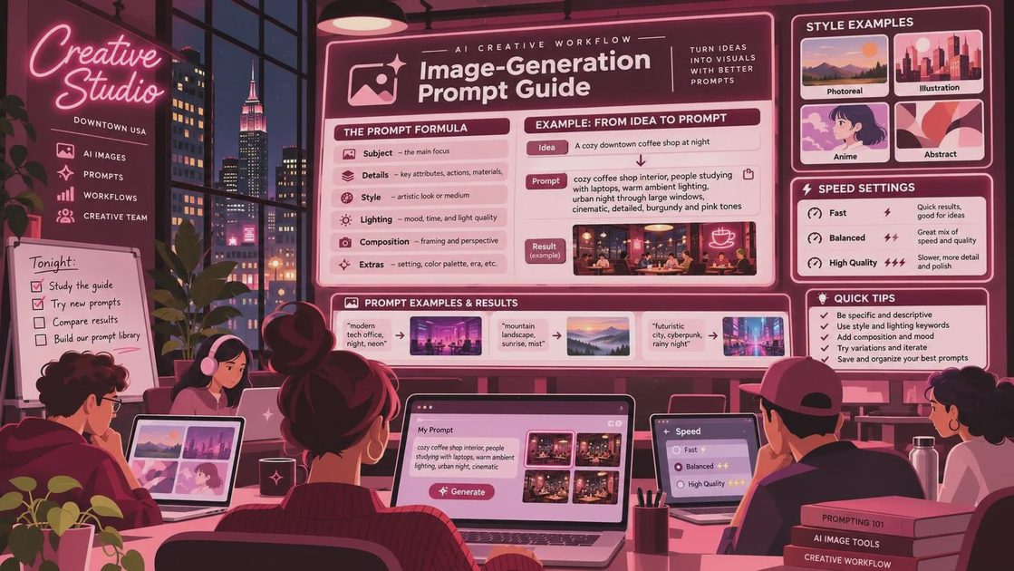
Diagnose the failure, not just the prompt
When a result misses the brief, identify which constraint failed. If the jar appears in the center instead of the lower right, simplify the composition and make placement explicit. If there are extra objects, remove decorative language and specify a single subject. If shadows make copy hard to read, ask for a cleaner background and test the type over it.
When the container shape or label is wrong, more adjectives may not solve the commercial problem. A real product has details that need approval: proportions, cap, color, label copy, and sometimes legally required wording. Use the generation as a mood or layout direction, then consider compositing an approved product photograph into the scene. Whether a particular interface offers editing, reference images, or masking is something to verify before planning the workflow around it.
Do not rely on generated packaging text for final copy. Add approved text in a design application, and inspect the image for stray letters, distorted edges, and duplicated components. Zoom in at delivery size as well as at 100 percent; different defects become obvious at different scales.
Hand off a result someone can revise
Keep the selected image alongside its prompt and generation details. Name versions by the meaningful change, such as “baseline” and “overhead light,” rather than calling everything “final.” For a client review, show the image in the intended layout and state what remains unfinished: for example, the jar is a placeholder and the label will be composited from approved artwork.
Before delivery, confirm the required dimensions, color specifications, file format, and usage terms with the relevant platform and client. Model and hosting licenses can differ, so verify the terms for the exact model and service you use rather than assuming every generated image has the same commercial permissions.
The goal is not a magic prompt. It is a documented route from brief to image, with enough evidence to repeat a promising direction or explain why a conventional product shot is the safer choice. Test it before you trust it.
For AI tool features, rules and availability, refer to their official sites.

Leave your thoughts here, too.