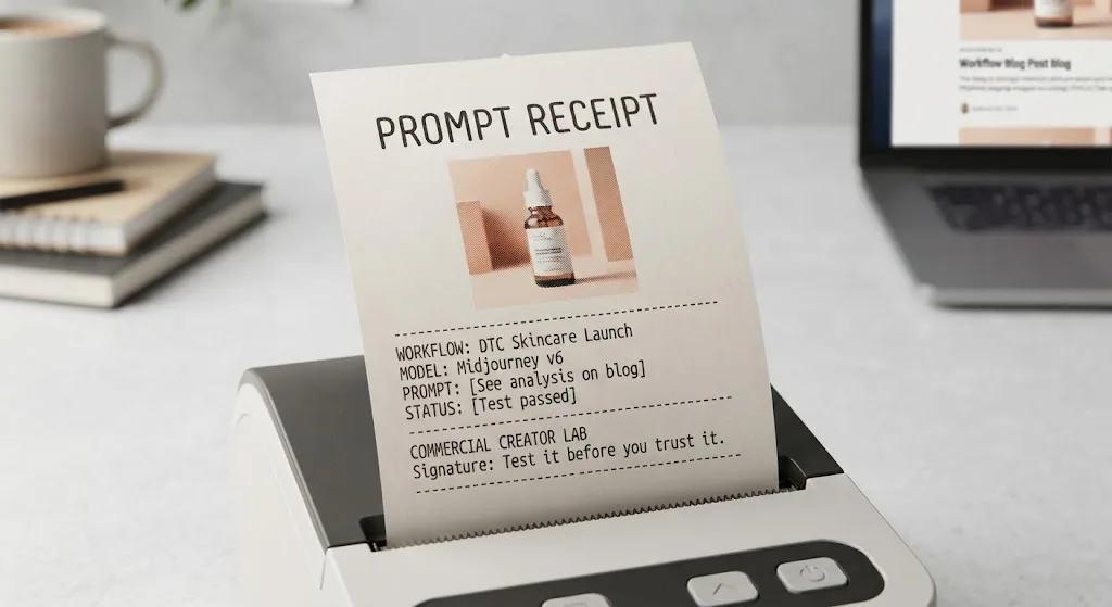
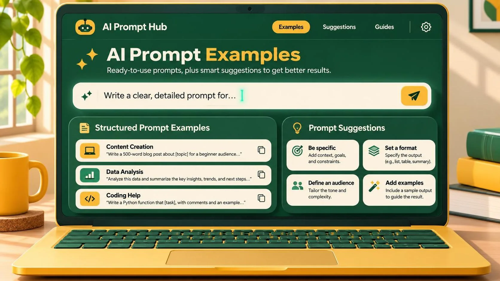
The most useful grok prompts describe the job, not just the aesthetic: name the subject, composition, lighting, and space needed for copy. For commercial work, treat the resulting image as a concept until you have checked the product details and usage rights. A gorgeous jar with an invented label is still the wrong jar.
The examples below are starting points, not verified test results. Grok’s image features and available controls can change, so check the interface you’re using before planning a client delivery around a particular feature.
Start with a brief the image can actually answer
A workable prompt has four parts: the subject, its surroundings, the camera composition, and the practical constraint. For a skincare concept, that might mean one unbranded jar, a pale stone surface, a close crop, and empty space for a headline. Those details give you something to evaluate besides whether the image looks expensive.
Try this as a first pass:
“Create a square commercial concept image of a plain white skincare jar on a pale stone surface. Use soft window light from the left, a warm neutral background, and a close three-quarter view. Leave the upper third uncluttered for a headline. No visible writing or logos.”
This is a concept for an art director, not a substitute for an accurate product photograph. If the actual packaging has a distinctive lid or exact color, use an approved product photo in the final layout rather than asking a generator to guess.
When writing grok prompts, specify the most important visual requirement early. If the ad needs copy space, say where it belongs. “Minimal” alone can still give you a beautifully empty background with no usable room once the headline and call to action go in.
Run a small batch with the same wording, then record which images respect the layout. Three or four attempts are enough to reveal an obvious composition problem before you invest time polishing the wrong direction. That is a suggested starting batch, not a promise of consistency.
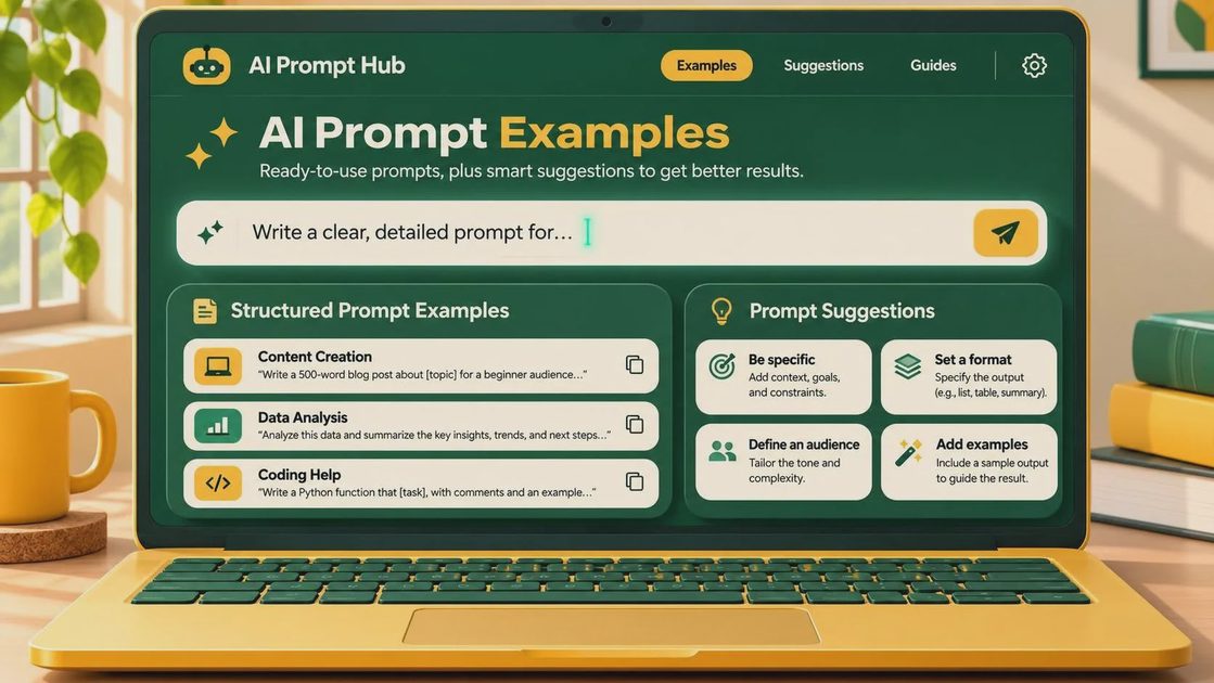
Grok prompts for three common briefs
For a product moodboard, focus on the environment rather than a precise package:
“Create an editorial product-photography concept for a citrus-scented candle. Show an unbranded cream-colored candle vessel on a light wood table, with a cut orange and a folded linen cloth nearby. Morning side light, soft shadows, restrained warm palette, horizontal composition. Leave clear space on the right for presentation notes.”
The candle’s shape, color, and props give the team a direction to discuss. They do not establish what a real product looks like. If the orange overwhelms the candle, revise the hierarchy: “The candle is the largest and sharpest object; the orange is a small background accent.”
For a social campaign concept, build around the placement:
“Create a vertical image concept for a coffee subscription announcement. Show a hand pouring coffee into a ceramic cup on a simple kitchen counter. Frame the action in the lower half, with a calm, lightly textured wall above it for a headline. Natural morning light, muted brown and cream colors, no text or logos.”
Check the hand, the stream of coffee, and the edge of the cup at full size. A small preview can hide a fused finger or a stream that misses the cup. Add the actual offer and branding in a design tool, where spelling and placement are controllable.
For an advertising direction, ask for one clear visual idea:
“Create a landscape campaign concept for a reusable water bottle. Place a single unbranded dark green bottle on a rocky surface against a softly blurred outdoor background. Use overcast daylight and a low camera angle. Keep the left half quiet for copy. Realistic materials, no writing or logos.”
This communicates mood and layout; it does not verify a bottle’s proportions, finish, or construction. For an existing product, compare the image with the approved reference before anyone mistakes the concept for a production asset.
Revise one variable at a time
The fastest way to improve grok prompts is to identify the failed requirement, then change the instruction responsible for it. If the bottle is too small, ask for it to occupy more of the frame. If the headline area is crowded, remove props from that area. Changing lighting, lens language, background, and subject size together makes it hard to tell what helped.
Keep the original prompt and save the revised version beside each output. A simple naming convention such as “bottle-layout-01” and “bottle-layout-02” is enough. Note which version the client selected and what still needs manual work. That record is more useful than a folder full of attractive images with no explanation of how they were made.

If the interface allows image references or editing, check how those controls work in your version before relying on them. An uploaded reference can help communicate a shape or mood, but it does not guarantee an exact reproduction. Review the output against the source, especially around labels, closures, and distinctive design details.
For a series, keep a short style specification outside the prompt: background color, lighting direction, camera angle, subject scale, and copy position. Repeat that specification across images, changing only the subject or scene. Expect to make a selection and adjust layouts afterward; matching language is not the same thing as guaranteed visual consistency.
From concept to client-ready file
Before delivery, inspect the image at its intended display size and at full resolution. Look for warped packaging, reflections that contradict the light source, strange contact shadows, and props that merge into the subject. Then place the real headline and logo in the layout. Empty space is only useful if the actual copy fits.
Avoid generating claims on a package or in an ad. A model can invent ingredients, certifications, prices, and promotional terms as easily as it can misspell a word. Get approved copy from the client and add it separately. For a product detail page where shoppers need to see the actual item, an approved photograph or carefully composited product image is the safer starting point.
Finally, review the applicable terms, permissions, and client agreement before commercial use. Rights to an output do not automatically clear a recognizable trademark, a person’s likeness, or a reference image you did not have permission to use. Keep the source files and approval notes with the deliverable.
The practical role of grok prompts is to make a direction visible quickly, then expose what still needs real production work. Test it before you trust it: a concept that survives the layout, accuracy, and rights checks is worth more than one that merely looks polished in a thumbnail.
For AI tool features, rules and availability, refer to their official sites.
Leave your thoughts here, too.