The first ai prompt I wrote for a product campaign produced a beautiful image, a crooked package, unreadable label text, and a hero object floating three inches above the table. The demo looked great. The deliverable did not. Since then, I have treated prompting as a production skill rather than a hunt for magical adjectives. A useful ai prompt defines the job, controls the composition, and leaves enough room for the model to solve visual details.
Start With the Brief, Not the Aesthetic
A weak ai prompt usually begins with a look: cinematic, luxurious, editorial, hyperreal. Those words can influence mood, but they do not tell an image model what must survive client review. Before writing, reduce the brief to five decisions: subject, setting, camera position, lighting, and required negative space.
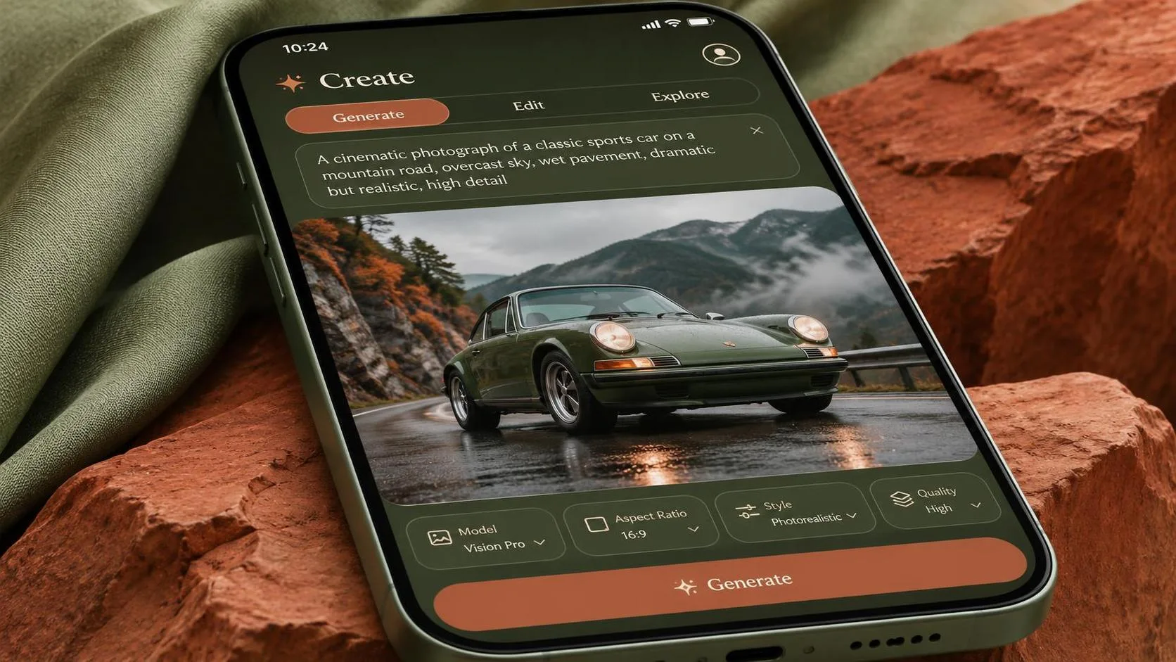
For example, “premium skincare bottle on a beige background” is a direction, not a production instruction. A stronger version says: “single amber glass serum bottle centered on a pale limestone pedestal, camera at product eye level, soft window light from the upper left, warm neutral palette, clean space on the right for headline copy, vertical 4:5 advertising composition.” The second version gives the model a job it can attempt repeatedly.
I also write down what cannot change. If the product needs to remain upright, say so. If the cap must stay attached, say so. If the image is for a social ad, specify the aspect ratio or intended crop. The model was not the only thing I got wrong in my early tests; I often left essential information in my head.
Use a Repeatable ai prompt Structure
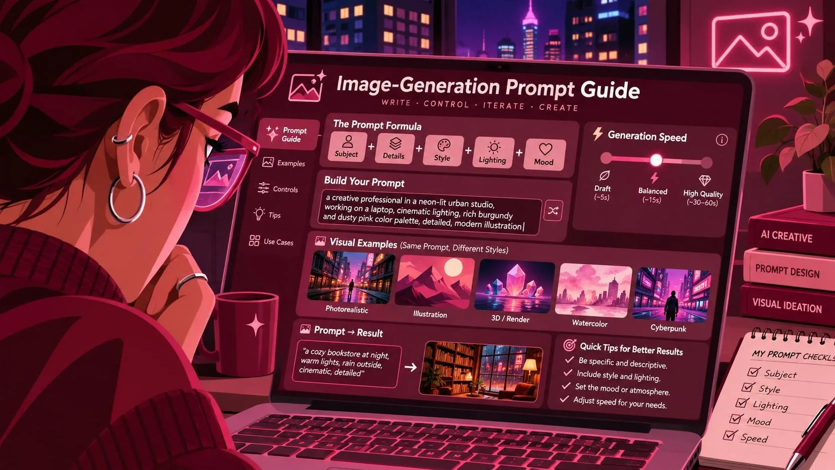
My current ai prompt structure is simple: subject, action or arrangement, environment, camera, light, material details, composition, and exclusions. I do not always use those labels in the final text, but I check each one before generating. This takes about two minutes and saves far more time than sorting through thirty attractive but unusable variations.
Consider a food brand concept. “Artisan coffee bag in a cozy kitchen” leaves almost everything open. A production-minded ai prompt could describe a matte forest-green coffee bag standing beside a ceramic cup on a walnut counter, morning side light, visible steam, shallow depth of field, camera three feet away at a slight downward angle, bag facing forward, uncluttered upper-left area for copy, realistic commercial product photography.
The final phrase matters. Add instructions such as “no extra packages,” “no hands,” “no warped logo area,” or “no text except the supplied package design” when the tool responds well to exclusions. Do not stack thirty negative terms automatically. Some models treat long exclusion blocks as noise, and some will still invent lettering. For exact brand text, I usually generate a clean composition first and finish typography in Photoshop or the client’s design system.
Test One Variable at a Time
When a generation fails, changing the entire ai prompt makes diagnosis almost impossible. I learned this after burning through a paid batch while trying to fix a bottle that kept leaning. I changed the lens language, background, lighting, scale, and camera angle in one pass. The next batch looked different, but I had no idea which change helped.
A better test holds most variables steady. In version one, change only “camera at eye level” to “camera slightly above product.” In version two, change only the background from limestone to matte paper. Generate four or eight images per version, depending on the tool and cost. Record the model, aspect ratio, seed when available, and any reference image. A plain text log is enough.
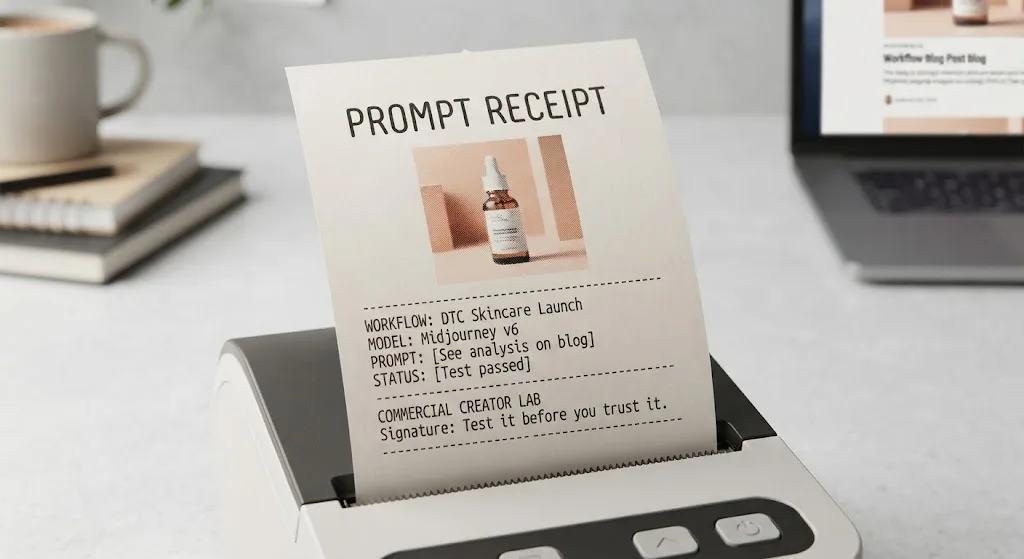
This approach works across Midjourney, Flux, Stable Diffusion, and ChatGPT Image, although controls differ. Midjourney is quick for exploration, Flux often handles product-oriented realism well, Stable Diffusion offers deeper control through workflows such as ControlNet, and ChatGPT Image is useful when conversational revisions are faster than parameter tuning. Those are workflow observations, not universal rankings. Test it before you trust it.

Control Composition Before Chasing Detail
Commercial images fail more often from composition than from missing atmosphere. A gorgeous background cannot rescue a product placed too close to the crop, a model facing away from the call to action, or a subject blocking the only usable text area. Your ai prompt should state placement in practical language: “subject on the left third,” “open space across the upper half,” or “hands below the product, not covering the label.”
For a paid-social concept, I might generate a 4:5 image with the product occupying roughly the lower-right third and a calm, low-detail wall across the upper-left half. I then create a separate 1:1 crop rather than assuming one generation will adapt perfectly. If a client needs a website hero, I request a wide composition with the subject pushed toward one side and enough background texture to support a headline.
Reference images can help, but they introduce their own failure points. A model may copy a pose while ignoring the intended product scale, or borrow colors that clash with the brand. Use references for broad geometry, lighting, or styling, then describe the nonnegotiable elements in text. “Match the diagonal arrangement” is more useful than “make it like this.”
Diagnose the Failure Instead of Adding More Adjectives
When an ai prompt produces a weak result, classify the failure before editing. If the object is wrong, the subject description or reference is insufficient. If the object is correct but misplaced, improve composition language. If the mood is right but the image feels cheap, specify materials, light direction, lens distance, and surface quality. If text is broken, plan a finishing step instead of repeating “perfect typography” six times.
I keep rejected generations in a folder because bad images explain the workflow better than polished ones. One batch of beverage concepts showed three recurring problems: extra cans appeared when I asked for a group scene, condensation covered the label, and highlights made the glass look metallic. The fix was not another style adjective. I requested one can, controlled the label-facing angle, reduced condensation to the lower third, and described transparent glass with soft edge highlights.
This process also prevents revision spirals. Instead of telling a client that the model “just needs another try,” I can explain that the composition is approved, while packaging fidelity still requires manual retouching. Useful is a higher bar than impressive.
Build a Small Prompt Template You Can Reuse
A reliable ai prompt template should speed up thinking without forcing every job into the same visual style. Mine begins with the commercial purpose, then names the subject and its position, describes the environment, sets camera and light, specifies crop and copy space, and ends with exclusions or finishing notes. I save successful versions with the output that passed review, not merely the sentence that sounded clever.
For example: “Commercial hero image for a direct-to-consumer candle launch: one cream ceramic candle centered on a rough travertine block, dried stems in the distant background, late-afternoon side light, warm natural shadows, camera at tabletop height, vertical 4:5 crop, open darker space above for headline copy, realistic wax and ceramic texture, no extra candles, no visible brand text, no distorted container.” That prompt is not universal. It is a starting specification that can be adjusted deliberately.
I also keep separate templates for product isolation, lifestyle scenes, ad concepts, and moodboards. Each has different priorities. Product isolation favors shape and label visibility. Lifestyle scenes favor believable interaction and depth. Moodboards can tolerate more abstraction, while client-ready advertising usually cannot.
The Practical Standard for Better Results
The best ai prompt is not the longest one. It is the one that makes success recognizable before you press Generate. Write the brief in visual terms, define composition, protect the elements that matter commercially, and change one variable when testing. Then inspect the image at its intended delivery size, not only as a large preview.
Expect to combine model output with ordinary design work. Masking, retouching, typography, color correction, and layout are not evidence that the workflow failed; they are often what makes the result deliverable. If a tool repeatedly damages the product or cannot hold a simple composition after a controlled test, stop feeding it revisions. Choose another workflow or use conventional photography and compositing.
I ran the test so you can skip the expensive part, but the final responsibility remains yours. Keep the prompt, settings, reference images, and rejected versions together. That record turns a lucky generation into a repeatable process—and gives you something useful to show when the client asks how the image was made.
For AI tool features, rules and availability, refer to their official sites.
Leave your thoughts here, too.