A client once sent me a single product photo and a one-sentence brief: “Need five paid-social concepts that feel premium but still convert.” That was the entire creative direction. No moodboard. No existing campaign language. Just a clean packshot of a matte-finish vitamin bottle on white and a deadline four days out.
I have run some version of this job dozens of times. The pattern is always the same. One static product image. A request for multiple concepts that can run as 4:5 posts, 1:1 carousels, and 9:16 stories. The pressure is not artistic. The pressure is consistency, speed, and the ability to hand the creative team something they can actually place copy on without another round of “the bottle looks different in every frame.”
This is the workflow I now use when the starting point is a single product photo and the deliverable is five distinct paid-social concepts. It is not the prettiest process. It is the one that has survived the most client reviews with the fewest revisions.
The Real Constraint Most People Ignore
Paid-social concepts are not five pretty images. They are five images that must:
Keep the product recognizable and correctly proportioned across every frame
Leave usable negative space or clean areas for short headlines and CTAs
Feel like a set rather than five unrelated experiments
Survive aggressive cropping for different placements
Arrive fast enough that the media buyer is not waiting on creative
If any of those fail, the concepts do not ship. Style points do not matter.
I treat the single product photo as the only source of truth for geometry, material, and label details. Everything else is built around protecting that truth while generating enough variation to give the client real options.
Step 1: Lock the Product Once
Before I generate anything for the concepts, I run a short product-only pass. The goal is a clean, controlled reference that the later lifestyle and conceptual frames can stay faithful to.
I write a tight product description from the original photo: exact bottle shape, cap style, label placement, material finish, and any critical proportions. I generate a small batch under neutral lighting and a straight-on or slight three-quarter angle. I pick the one or two frames where the bottle geometry and label are most accurate. Those frames become the visual anchor. I do not move forward until this step is solid.
This takes fifteen to twenty minutes and prevents the later concepts from drifting into “close enough” territory that clients always notice.
Step 2: Define the Five Concept Directions Before Prompting
I never start generating and hope five good ideas appear. I define the directions first, in plain language, against the brief and the platform requirements.
For the vitamin bottle job the five directions were:
Clean kitchen counter, soft morning light, lifestyle but product-hero
Minimal bathroom shelf, cool neutral tones, self-care framing
Soft fabric surface with subtle texture, warmer light, “daily ritual” feel
Abstract geometric support (simple block or plinth), high-contrast, more design-forward
Overhead flat-lay with complementary objects kept secondary, open space for copy
Each direction had a clear purpose and a clear spatial plan for where the headline could sit. I wrote one sentence per concept describing the surface, the light, the camera height, and the negative-space zone. Only after those five sentences existed did I open the model.
This step is the difference between a coherent set and five disconnected experiments.
Step 3: Build Every Prompt From the Same Foundation
Every concept prompt starts with the locked product description. Same language. Same material notes. Same proportion emphasis. Only the scene, lighting, composition, and exclusion blocks change.
I use the four-part structure I rely on for almost all commercial work:
Product and material (identical across all five)
Scene and lighting (unique to the concept)
Composition and hard constraints (camera + negative space specific to that concept)
Short exclusions (hands, text, busy backgrounds, extreme angles)
Style language stays minimal until the structure is producing usable frames. For this job I added only short mood notes after the first batches confirmed the bottle was stable: “calm premium,” “soft natural materials,” “quiet morning.” Nothing heavier.
Because the product block never changed, the bottle stayed recognizable across the set. That single decision eliminated the most common client rejection I used to see.
Step 4: Generate in Tight, Scored Batches
I do not generate fifty images and then cherry-pick. I generate small batches of four to six per concept, score them immediately against three criteria, and adjust only one variable at a time.
Scoring criteria for this job:
Product geometry and label integrity
Usable space for headline and CTA in the planned zone
Overall mood match to the concept direction without fighting the product
Anything that fails the first two criteria is discarded no matter how attractive it looks. I keep a simple running note of what failed and why. After two or three batches per concept I usually have two or three strong candidates. I select one primary and one backup for each direction.
Total generation time for all five concepts on the vitamin bottle job was just under two hours, including the initial product lock and the scoring passes. That is faster than the old method of generating large open-ended batches and then trying to force consistency after the fact.
Step 5: Build the Delivery Set for Real Placements
Once I have the five primary frames, I test them against the actual crops the client will use. I place a temporary headline block in the planned negative-space zone and check 4:5, 1:1, and 9:16 versions. If the product gets uncomfortably close to the edge or the text area collapses under the crop, I either regenerate that concept with a tighter composition constraint or swap in the backup frame.
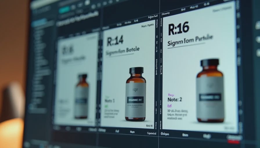
I also check the five images side by side. The bottle should feel like the same object in every frame. Lighting temperature can vary with the concept, but material response and proportions should not. If one frame breaks the set, it does not ship.
The final package I deliver is simple: five primary images, five backups, a short note on recommended crop and text placement for each, and the exact product description I used so the client’s designer can stay consistent if they need additional frames later.
What Changed Compared to My Earlier Approach
Before I tightened this workflow I used to treat each concept as a separate creative exploration. Different product language, different levels of style pressure, different levels of attention to negative space. The results looked more varied and required more revision. Clients would approve the mood of one image and then ask why the bottle looked slightly taller or more reflective in the next.
Locking the product description and defining the five directions in advance removed most of that friction. The concepts still feel distinct because the scenes and lighting are different. The set holds together because the product never became a secondary element.
A Note on Tools
I have run this exact workflow in Midjourney, Flux, and combinations of both. The structure matters more than the model. Flux has given me slightly better product consistency on recent bottle and packaging jobs. Midjourney still produces stronger immediate mood in some lifestyle directions. I choose based on the specific product and the consistency pressure of the set, not on a general ranking.
Whatever the tool, I still start with the product lock and the five written directions. Skipping those steps is the fastest way to spend an afternoon generating images that look good individually and fail as a campaign set.
The Practical Outcome
On the vitamin bottle job the client approved four of the five concepts on the first review and requested only a minor lighting adjustment on the fifth. No comments about bottle proportions or label distortion. The media buyer had assets in hand the same day. That is the standard I now aim for every time the brief starts with one product photo and a request for multiple paid-social concepts.
The workflow is deliberately unglamorous. It prioritizes the constraints that actually determine whether the work ships. One locked product description. Five clear directions written before any generation. Identical foundation structure across every prompt. Tight scored batches. Final check against real crops and side-by-side consistency.
That is how a single product photo becomes five concepts that survive the brief instead of five attractive frames that fall apart under placement and review.
I ran the process so you can skip the expensive exploration phase. Test the structure before you trust the output. The demo still looks great. The deliverable is the only thing that counts.
Brands and cases are illustrative. For AI tool features, rules and availability, refer to their official sites.
Leave your thoughts here, too.