A small e-commerce brand came to me with one product photo, a short brand description, and a request that sounded simple: “We need a starter kit so we can launch a campaign without starting from zero every time.” They had no existing creative system. Every previous post had been a one-off. The result was inconsistent product appearance, different lighting every week, and a constant need to reinvent the visual direction under deadline pressure.
I built them a campaign starter kit. Not a full brand book and not a set of final ads. A practical, reusable set of assets and rules that let them generate new campaign images quickly while keeping the product and the visual territory coherent. This is the workflow I now use when a small brand needs that foundation.
What a Campaign Starter Kit Actually Contains
For most small e-commerce brands the useful kit has five parts:
A locked product reference set
Three clear visual territories
A short list of approved surfaces and lighting setups
Composition and negative-space rules that match their real placements
A small library of ready-to-adapt prompt foundations
That is enough to stop the weekly reinvention cycle without over-building a system the brand will never maintain.
Step 1: Lock the Product Once, Properly
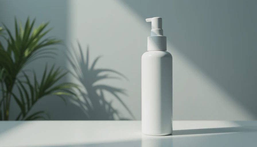
Everything starts with the product. I take the best available packshot or the cleanest client photo and build a tight product description: exact form, material, finish, critical proportions, label or logo placement. I generate a small neutral set under simple, even light and select the frames where the product is most accurate. Those frames become the permanent visual source of truth.
I also write the product block that will sit at the top of every future prompt. This block does not change unless the physical product changes. The rest of the kit is built around protecting it.
This step is the highest-leverage decision in the entire process. If the product is unstable, every later campaign image inherits the problem.

Step 2: Define Three Territories the Brand Can Actually Own
I do not create ten mood directions. I create three. Each one is written in plain language and tied to a practical use case.
For a recent skincare client the three territories were:
Clean daily ritual – soft neutral surfaces, gentle window light, quiet self-care framing
Elevated but approachable – slightly more architectural surfaces, controlled soft light, more design-led negative space
Warm lifestyle support – simple fabric or wood surfaces, warmer light, closer intimacy without losing product clarity
Each territory includes a one-sentence description of surface, light, camera approach, and spatial priority. I also note the generic version of that territory so we can actively avoid it. Three is enough for variety and limited enough that the brand can stay consistent.
Step 3: Choose a Small Set of Approved Surfaces and Lighting Setups
Unlimited options create drift. I select four to six surfaces that work across the territories and two or three lighting setups that keep the product honest. Soft window light from a consistent direction, a mild overhead soft source, and one cooler neutral option are usually sufficient.
These choices are written as reusable prompt fragments. The brand (or I) can swap them without rewriting the entire foundation. The limitation is deliberate. It keeps the campaign kit from turning into another source of inconsistency.
Step 4: Write Composition and Negative-Space Rules That Match Real Placements
I define the camera and framing rules that will be used across the kit. Height landmarks on the product, directional angle, and explicit product placement zones are stated as constraints. I also define the negative-space rules that match the brand’s actual channel needs—usually a clear right third or left third for headlines and CTAs, tested against 4:5, 1:1, and 9:16 crops.
These rules are written once and reused. They prevent the most common late-stage failure: images that look good in isolation and fail when the designer places copy or the media buyer applies the real crop.
Step 5: Build the Prompt Foundation Library
I create a small set of ready-to-adapt prompt foundations—one for each territory—using the locked product block, the approved surfaces and lighting, and the composition rules. Style and mood language stays minimal and is added only after the structure is confirmed.
Each foundation is short, readable, and designed to be varied by changing one or two blocks (surface, light, or minor prop) rather than by rewriting from scratch. This is the part of the kit the brand can actually use under weekly pressure.
Step 6: Deliver the Kit as a Working System, Not a Deck of Pretty Images
The final deliverable includes:
The locked product reference frames and the exact product prompt block
The three territory descriptions with notes on what to avoid
The approved surface and lighting fragments
The composition and negative-space rules
The prompt foundations ready for adaptation
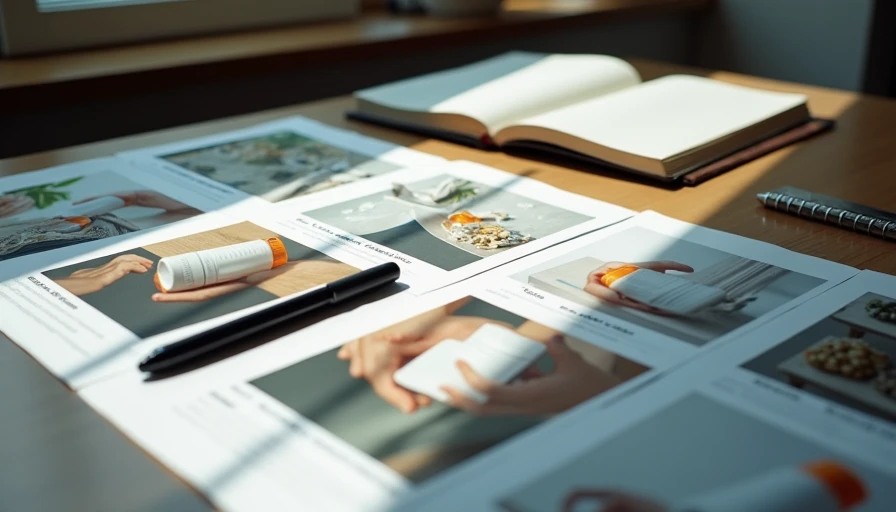
A short side-by-side example set showing the product holding across the three territories
I also include a one-page usage note that explains how to generate a new campaign image without breaking consistency: keep the product block identical, stay inside the approved surfaces and lighting, respect the composition rules, and only then adjust mood.
The goal is a system a busy founder or junior marketer can use without needing me for every post.
Time and Practical Reality
A complete starter kit of this scope usually takes one focused day. The majority of the time is spent on the product lock, the territory definitions, and the testing of composition rules under real crops. Generation itself is relatively fast once those decisions are made.
I have built these kits in Midjourney, Flux, and combinations of both. The structure matters more than the model. Flux has given me better product stability across the territory set on recent packaging jobs. Midjourney still produces strong mood in some of the warmer territories. I choose based on the product and the consistency pressure, not on a fixed ranking.
What the Kit Prevents
Without a starter kit, small brands tend to repeat the same expensive cycle: new prompt from scratch, inconsistent product appearance, last-minute lighting decisions, and creative that feels slightly different every week. The kit does not eliminate creative work. It eliminates the repeated re-solving of problems that should have been settled once.
Clients who receive this foundation stop asking for “a few more options that feel more premium” and start asking for “a new image inside territory two with the warmer surface.” That shift is the entire point.
The Outcome That Matters
A campaign starter kit is successful when the brand can produce new images that still look like they belong to the same visual system weeks later. Product fidelity holds. Territories remain distinct. Negative space stays usable. The weekly creative process becomes adaptation instead of reinvention.
I lock the product first. I define three territories the brand can own. I limit surfaces and lighting to a small approved set. I write composition and space rules that match real placements. I deliver reusable prompt foundations and clear usage notes. That is the entire method.
The kit is deliberately practical rather than exhaustive. Small brands do not need more options. They need a reliable starting point that keeps the product honest and the campaign coherent. Test the system with a real weekly brief before you trust it at scale. The demo can look organized. The kit has to work when the next campaign deadline arrives.
Brands and cases are illustrative. For AI tool features, rules and availability, refer to their official sites.


Leave your thoughts here, too.