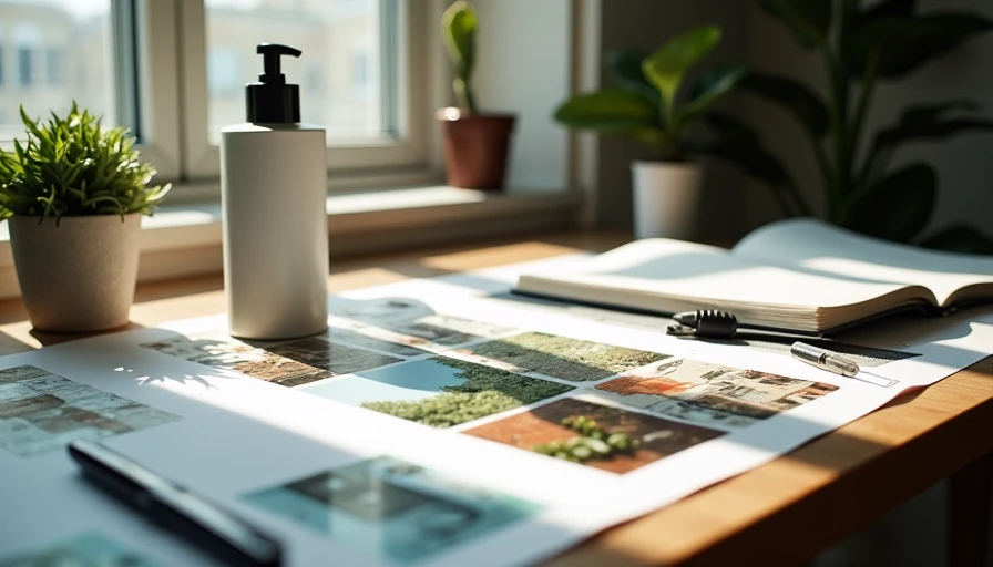
Most AI-generated skincare moodboards look like they were made by the same person. Soft light, pale stone, a single droplet, muted greens, the same frosted bottle angle repeated with minor variations. Clients can feel the sameness even when they cannot name it. The brief says “elevated, clean, modern.” The output says “every other DTC brand that used the same prompt template.”
I have built dozens of these boards for small skincare and wellness brands. The ones that survive client review share a common trait: they start from the product and the brand’s actual constraints instead of from a generic “premium skincare” aesthetic. This is the workflow I now use when the deliverable is a moodboard that has to feel specific rather than safe.
What a Moodboard Has to Do for a DTC Brand
A moodboard is not a set of pretty frames. It is a decision tool. It has to help the client and the creative team align on territory before anyone invests in final assets or paid media. That means the board must:
Keep the product recognizable and correctly proportioned
Show clear visual territories the client can choose between
Leave enough variation that the brand does not feel locked into one cliché
Survive the question “does this still look like us when we put our label on it”
Avoid the generic soft-minimal look that already saturates the category
If the board only looks expensive, it fails. If it looks expensive and specific to the brand’s product and positioning, it works.
The Starting Point Is Never the Aesthetic
I begin every skincare moodboard job with three concrete inputs:
The actual product photo or packshot
Any existing brand language or previous creative that the client still likes
The practical constraints of the channels the images will eventually support
I do not open the model and ask for “luxury skincare moodboard.” That prompt produces the average of every similar image the model has seen. Instead I write a short internal brief that translates the client’s emotional language into technical requirements. “Elevated but approachable” becomes specific decisions about light quality, surface materials, color temperature, and how much of the frame the product occupies. “Clean but not clinical” becomes decisions about texture, shadow softness, and whether secondary objects are allowed.
Only after that translation exists do I touch the prompt.
Step 1: Lock the Product Before Any Atmosphere
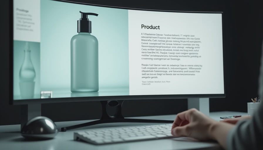
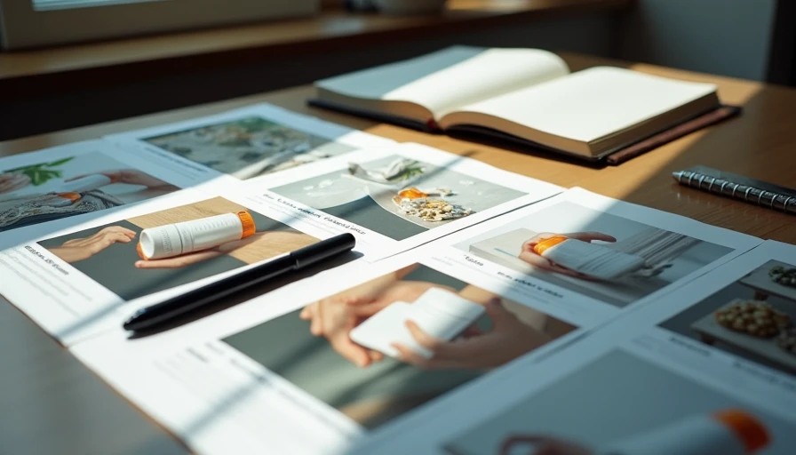
The product is the only element that must remain consistent across every frame on the board. I run a short product-only pass first. Exact bottle shape, glass type, pump or dropper details, label placement, and material finish go into the prompt before any scene language. I generate a small neutral set and select the frames where the product geometry and finish are most accurate. Those frames become the reference standard for everything that follows.
This step feels slow when the client is waiting for “the vibe.” It is the single highest-leverage decision in the process. Once the product is unstable, every later mood variation compounds the error.
Step 2: Define Three Distinct Territories on Paper
I never generate my way into variety. I define the territories first in plain language. For a recent vitamin-C serum client the three territories were:
Soft bathroom shelf, cool neutral light, quiet self-care framing
Warm linen or raw fabric surface, slightly closer crop, daily-ritual intimacy
Clean architectural surface with subtle geometric support, higher contrast, more design-led
Each territory had a one-sentence description of surface, light, camera distance, and spatial priority. I also noted what would make that territory feel generic so I could actively avoid it. Soft bathroom shelf becomes generic when the light turns flat and the palette turns identical to every other “clean girl” board. Warm linen becomes generic when the fabric texture overwhelms the product. Architectural support becomes generic when it turns into the same pale stone plinth everyone else uses.
Writing the territories before prompting forces the variation to be intentional instead of accidental.
Step 3: Build Every Prompt From the Same Product Foundation
Every frame on the board uses the identical product block. Only the scene, light, composition, and exclusion language change. This is the same four-part structure I use for most commercial work, applied to moodboard volume:
Product and material (locked)
Scene and lighting (unique to the territory)
Composition and constraints (camera + space needs for that territory)
Short exclusions (hands, text, busy backgrounds, extreme angles)
Style and mood language stay minimal until the structure is producing usable frames. I add the smallest possible atmospheric notes only after a batch shows that the product and the territory are both holding. Leading with “ethereal soft luxury” or “clean girl aesthetic” is the fastest way to collapse the board back into the generic average.
Step 4: Generate Tight Batches and Score Against Specificity
I generate in small batches of four to six images per territory. I score each frame on three criteria before I look at overall attractiveness:
Product fidelity against the locked reference
Clear fit to the written territory without drifting into the other two
Absence of the generic markers I listed earlier
Frames that look beautiful but could belong on any other skincare board are discarded even if the product is correct. The goal is not the most polished image. The goal is the image that makes the territory feel distinct and still true to the product.
After two or three batches per territory I usually have enough strong candidates to build the board. I select three to five frames per territory, check them side by side for product consistency, and only then apply any final light or color refinement that the set still needs.
Step 5: Present the Board as Decision Material, Not Decoration
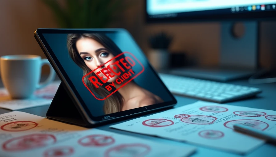
The deliverable I send is organized by territory, not by overall beauty. Each section includes a short note on what the territory is intended to solve and where the product and space are holding. I also include one or two frames that I rejected for being too generic so the client can see the boundary I was protecting.
This presentation style changes the conversation. Instead of “which of these do you like,” the discussion becomes “which territory feels most like the brand we want to build.” That is a more useful question and it leads to fewer late-stage reversals.

What I Actively Avoid
I keep a short internal list of generic skincare moodboard clichés and treat them as soft exclusions:
The same pale stone or concrete plinth everyone else uses
Overly symmetrical single-product hero shots with no spatial tension
Identical soft frontal light across every frame
Palette that defaults to the same muted sage and warm beige combination
Droplets or water elements that feel decorative rather than purposeful
None of these are forbidden forever. They become problems when they appear by default rather than by deliberate choice. If a territory genuinely needs a stone surface, I specify a particular stone and light it in a way that is not the category average. The difference is intention.
Time and Tool Notes
On a typical three-territory skincare moodboard I spend roughly ninety minutes to two hours from product lock to presentable board. The majority of that time is in the definition and scoring steps, not in pure generation. Flux has given me better product consistency on recent glass and pump bottles. Midjourney still produces strong mood in some of the warmer territories. I choose based on the product and the consistency pressure, not on a fixed ranking. The structure of the workflow matters more than the model.
The Outcome That Matters
The boards that survive are the ones where the client can point to a territory and say “this feels like us” rather than “this looks expensive.” Specificity is the entire job. Generic elevated skincare is already abundant. A moodboard that protects the product, defines clear territories, and actively rejects the category average gives the brand something it can actually own.
I start with the product and the written territories. I keep the prompt structure identical across the set. I score for specificity as hard as I score for beauty. That is how a DTC skincare moodboard stops looking like everyone else’s and starts looking like a decision the brand can stand behind.
Test the territories before you trust the aesthetic. The demo can look clean. The board has to feel specific.
Brands and cases are illustrative. For AI tool features, rules and availability, refer to their official sites.
Leave your thoughts here, too.