The first prompt looked brilliant. The fourth variation looked like it had been assembled by a committee of distracted raccoons. That is the difference between a lucky image and a repeatable workflow. Prompt hero is not about discovering a magic sentence that makes Midjourney, Flux, Stable Diffusion, or ChatGPT Image do everything perfectly. It is about translating a commercial brief into decisions the model can actually follow.
I use that process for product concepts, paid-social images, moodboards, and campaign exploration. The useful result is not the most cinematic frame in a contact sheet. It is the image that survives a client review, leaves room for copy, and can be revised without starting from zero.
What prompt hero means in a real production workflow
A prompt hero is a structured brief, not a pile of adjectives. Start with the subject, then define the action, setting, composition, lighting, camera viewpoint, color direction, and intended use. Each part answers a different production question.
For example, “premium skincare bottle, dramatic, beautiful, editorial” gives a model plenty of mood and almost no usable art direction. A stronger version might say: “single frosted glass serum bottle on a pale stone plinth, centered with clear negative space above for headline copy, soft north-window light from camera left, restrained sage and cream palette, 85mm product photography, clean luxury campaign image, vertical 4:5 composition.”
That wording does not guarantee success. It does make failure easier to diagnose. If the bottle is off-center, composition was not controlled well enough. If the label is unreadable, the model is being asked to solve a problem that often belongs in Photoshop or a design tool. If the palette wanders, the color instruction needs to become simpler and more prominent.
The first test batch should contain a narrow question. Do not test subject, background, lighting, lens, aspect ratio, and visual style all at once. I usually hold most variables steady and change one element across four to eight generations. It is less exciting than typing “make it cooler,” but it produces information.
Build the prompt in layers instead of chasing adjectives
The most reliable prompt hero structure I have used is a short stack of layers. Begin with the commercial subject: what must be visible and recognizable? Add the composition: close-up, three-quarter view, overhead, centered, or positioned to one side. Then specify the environment and light. Finish with output requirements such as aspect ratio, clean negative space, or a restrained palette.
A useful example for a shoe brand is: “single white running shoe, three-quarter profile, suspended slightly above a matte cobalt platform, studio sweep background, crisp softbox lighting, subtle contact shadow, product advertising photography, shoe facing right, open space on the left for copy.” This is more controllable than “dynamic sports shoe ad with energetic lighting.” The latter sounds exciting but leaves the model to invent the layout.
Keep style references functional. “Editorial still life” can communicate restraint and controlled lighting. “High-fashion campaign” may introduce unnecessary styling, models, accessories, or surreal scenery. When a reference produces unwanted baggage, describe the visual property you need instead: hard rim light, muted contrast, shallow depth of field, or a paper-texture backdrop.
For Flux or Stable Diffusion, negative prompts and settings can help, but they are not a substitute for a clear positive prompt. I would rather remove “extra objects, distorted product, messy background” by simplifying the scene than stack thirty negative terms onto an already confused instruction. In Midjourney, aspect ratio and image references can have more practical impact than another paragraph of style language.
The test I run before showing anything to a client
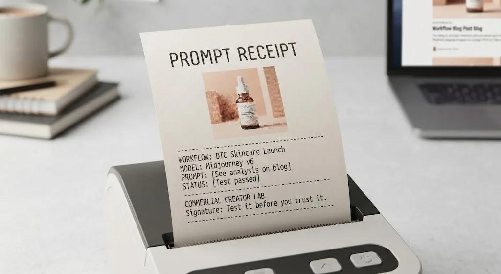
My prompt hero test starts with a contact sheet, not a single cherry-picked result. I generate a small batch, label each image, and record the model, aspect ratio, seed when available, reference image, and prompt version. The record can be a spreadsheet or a plain folder with text files. The important part is being able to reproduce the best direction.
Then I score each image against the brief. Is the product shape plausible? Is the intended text area actually empty? Does the camera angle support the ad rather than merely look dramatic? Are reflections, hands, packaging, and shadows clean enough for a designer to finish the image? A gorgeous image that fails those questions is a reference, not a deliverable.
I also inspect repeated defects. If every generation adds a second cap, changing the seed will not solve the underlying problem. Reduce competing objects, state “one bottle” early, and make the background less elaborate. If every subject faces the wrong direction, specify the direction in plain language and use composition controls where the tool supports them.
The model was not the only thing I got wrong in an early product test. I asked for a hero image, lifestyle atmosphere, readable packaging, supporting props, and a space for copy in one prompt. The result had attractive lighting and no reliable product identity. Splitting the assignment into a clean product plate and a separate lifestyle concept cut the revision loop dramatically.

Where the workflow breaks down
A prompt hero cannot fix a weak source image or an impossible brief. Product identity is especially fragile when the reference has small text, unusual geometry, transparent packaging, or reflective surfaces. AI tools often create a convincing object that is not the actual object. That distinction matters when an e-commerce client needs accurate packaging.
Use image generation for ideation, backgrounds, visual directions, and controlled composites when the product can be protected separately. For a final listing image, photograph the real item or use a carefully edited product render when accuracy is non-negotiable. A generated label that looks nearly correct is still wrong.
People and hands create another failure zone. If the campaign requires a consistent person across several scenes, save reference images, lock the visual description, and expect to do selection and retouching. Do not promise seamless continuity because one attractive frame happened to work. Test the hardest pose, the most visible hands, and the least flattering angle before approving the approach.
Text inside images deserves the same skepticism. Current tools can produce occasional clean lettering, but a brand headline, price, or legal line belongs in layout software unless you have verified the exact output. Generate the visual with deliberate empty space, then add typography in Figma, Photoshop, or the client’s normal production tool.
A faster handoff for commercial work
When I deliver a successful direction, I include the prompt version, selected images, rejected examples, and a short explanation of what changed. That makes client feedback more specific. “Make it premium” is difficult to act on; “use the second background, remove the citrus props, keep the bottle on the right, and increase empty space above it” is production information.
The prompt hero approach also reduces tool switching. I might explore composition in Midjourney, test a product-sensitive direction in Flux, and finish layout in Photoshop. The best tool is the one that solves the current bottleneck, not the one with the loudest demo. If a workflow produces beautiful concepts but cannot preserve the product, it belongs in exploration rather than final production.
Before delivery, check dimensions, cropping, color consistency, object count, visible artifacts, and license terms for the tool and plan you used. Open the image at the size the client needs. Problems hidden in a thumbnail often become obvious in a large social placement or print layout.
The practical takeaway
Prompt hero is a habit of testing, documenting, and separating creative exploration from production accuracy. Write the brief in layers, vary one major decision at a time, inspect batches instead of lucky samples, and keep a human editing step where the model remains unreliable.
The demo looked great. The deliverable did not. That is not a reason to abandon AI image generation; it is a reason to raise the standard. Useful is a higher bar than impressive. Test it before you trust it, and let the brief—not the novelty of the tool—decide what survives.
For AI tool features, rules and availability, refer to their official sites.
Leave your thoughts here, too.