
I once generated thirty-two images of the same product before I realized the problem was not the model, the prompt length, or the lighting. It was the composition instruction I had been repeating without noticing how weak it was.
The job was a simple e-commerce set for a matte ceramic pour-over kettle. The client needed a clean three-quarter view with the kettle clearly dominant, enough space on one side for a short headline, and a consistent camera height so the set would feel coherent in a carousel. I wrote what I thought was a solid prompt, generated the first batch, and immediately started correcting surface-level problems: material sheen, background tone, slight proportion drift. Each new batch fixed one issue and introduced another. By generation twenty I was deep in the familiar spiral of adding more descriptive language. By generation thirty I had a folder full of almost-good images and no deliverable.
The useful lesson only appeared when I stopped generating and looked at the failures as a group.
What the Thirty-Two Frames Actually Had in Common
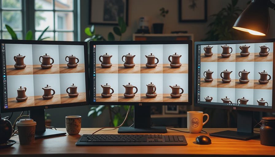
I laid the rejects out in a grid. The material varied. The light varied. The background tone shifted. The kettle proportions drifted in the usual ways. But one failure repeated in almost every frame: the camera position and the product placement were never truly locked. The kettle sat slightly higher or lower, closer or farther, more centered or more off-center. The “three-quarter view” I had asked for was being interpreted as a range rather than a rule. Negative space appeared and disappeared because the product itself was floating inside the frame instead of being anchored to a consistent layout.
I had been treating composition as a soft stylistic request. The model had treated it the same way.
The Weak Language I Kept Reusing
My composition line for most of those thirty-two generations looked something like this:
“slight three-quarter view, product slightly off-center, clean composition, room for text”
It sounds reasonable. It is almost useless under pressure. Every term is relative. “Slight” is not a measurement. “Slightly off-center” gives the model permission to choose its own offset. “Clean composition” is a conclusion, not an instruction. “Room for text” is a hope.
When the rest of the prompt is also full of soft language, the model averages everything into a vaguely pleasing but inconsistent result. That is exactly what I had produced: thirty-two vaguely pleasing, inconsistent images.
The Moment the Pattern Became Obvious
I picked the three least-bad frames and the three worst frames and compared only the placement of the kettle inside the frame. The variation was larger than I had noticed while generating one batch at a time. In some images the kettle occupied the vertical middle. In others it sat lower. The handle position relative to the frame edge changed enough that a headline placed in the “open” area would collide with the product in half the set. The camera height was drifting even though I had asked for the same view each time.
The material and lighting problems I had been chasing were real, but they were secondary. The primary failure was compositional instability. Until that was fixed, every other correction was temporary.
The Fix That Ended the Spiral
I deleted the soft composition language and replaced it with concrete layout rules:
“slight overhead three-quarter view, camera height just above the kettle lid, product placed in the left two-thirds of the frame, clear empty space occupying the right third with no objects”
I kept the product and material block identical. I kept the lighting simple. I generated a new batch of eight. Six of them held the same approximate camera height and product placement. The negative space survived a basic text overlay test. The set finally looked like it belonged together.
Total generations after the rewrite: eight. Usable frames: six. The previous thirty-two had produced zero that met the full brief.
The Lesson I Now Apply to Every Job
Composition is not a mood. It is a set of measurable constraints. If the camera height, product placement, and empty-space zone are not stated as rules, the model will invent its own and they will not match across a set. Soft language produces soft consistency.
I now write composition as a short block of hard instructions:
Camera position and height in plain terms
Product placement relative to the frame (left two-thirds, centered, lower third, etc.)
Explicit empty-space zone with a fraction or clear description
Any crop or aspect requirements that matter for delivery
I place this block after product and scene, before exclusions and long before style. I treat it with the same priority as material accuracy. If the composition constraints are weak, I do not proceed to large batches.
How I Diagnose Composition Failure Faster Now
When a batch looks almost good but the set falls apart side by side, I check composition before I touch material or lighting. I ask three questions:
Is the camera height consistent enough that the product does not appear to grow or shrink?
Is the product anchored to the same region of the frame across the set?
Does the empty-space zone survive the actual crops the client will use?
If any answer is no, I rewrite the composition block and regenerate a small test batch before I invest in more volume. This single habit has cut the number of long failure spirals more than any other change in my process.
Why This Failure Keeps Happening
Most prompt advice focuses on style, lighting, and quality boosters. Composition is usually mentioned as an afterthought or left to vague terms like “rule of thirds” or “balanced.” Those terms are not precise enough for commercial sets that must survive carousel placement and headline overlay. The model needs layout rules, not compositional philosophy.
I made this exact mistake for months because the individual frames still looked attractive. Attractiveness hides compositional drift until you place the images next to each other or drop text on them. By then the time is already spent.
The Practical Rule I Keep on a Sticky Note
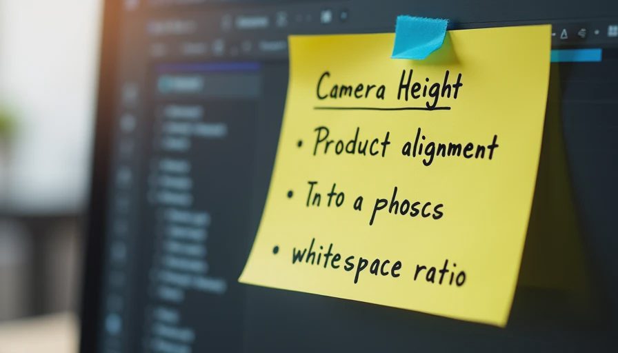
If the set does not hold together side by side, fix composition before you fix anything else. Soft composition language is the most common reason I used to generate thirty images and still have nothing to deliver. Hard layout rules are the fastest way out of that loop.
The thirty-two failed generations of the pour-over kettle are still in the folder. They are more useful than the final approved set because they show the exact pattern: attractive individual frames, unstable placement, repeated soft instructions, and a long, expensive path to a problem that was simple once I finally looked at it directly.
Composition is a constraint system. Write it that way. Test it side by side. Only then add the language that makes the frames feel finished. The model will follow the rules you actually give it. It will not invent the consistency you only implied.
I burned the thirty-two generations so you can skip straight to the layout rules. Test the composition before you trust the batch. The demo can look good one frame at a time. The set has to survive the grid.
Brands and cases are illustrative. For AI tool features, rules and availability, refer to their official sites.




Leave your thoughts here, too.